On Nov. 1, Nike and the National Basketball Association (NBA) released the 2021-22 City Edition Uniforms for the NBA’s 30 franchises. Updated City Edition Uniforms have been released yearly since its inaugural 2017-18 season, aiming to represent the unique culture of each franchise’s home cities.
This year’s uniforms are inspired by the NBA’s 75th anniversary and aim to combine past elements of each team’s jersey history into one unified look. There is a clear distinction between the uniforms that excel at forming their visions into reality, and those who fall short.
The Best:
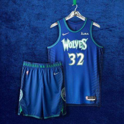
Minnesota Timberwolves: 5/5
If any franchise has a jersey that perfectly encapsulates the goal of this year’s City Edition theme, it is the Minnesota Timberwolves.
This jersey utilizes aspects of the franchise’s distinct uniform history: the original blue and green color scheme from when the team entered the NBA, the lettering from their 2000s black and green jerseys, and their modern logos. All of these design features blend together extremely well, creating an aesthetically pleasing uniform.
Toronto Raptors: 4.8/5
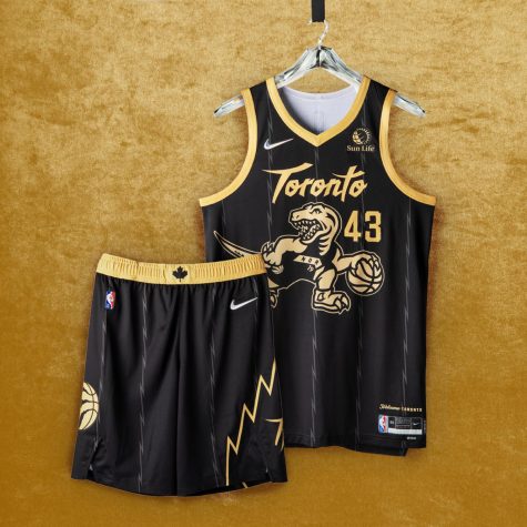
The Toronto Raptors City Edition Jersey is the only uniform released that mixes the most interesting aspects of their uniform history as well as the Timberwolves’ did.
The use of the iconic dinosaur logo the team used during their inaugural years will look good on any jersey, and the blending of the black-and-gold color scheme looks fantastic. Furthermore, the “Toronto” lettering on the front adds vibrancy to the overall design.
What surprises me the most about this uniform is the placement of the number on the front. While the font does not clash with the other aspects of the jersey, I think its proximity to the dinosaur design and lettering is too close and could have been moved over slightly to give everything a bit more room to breathe.
San Antonio Spurs: 4.5/5
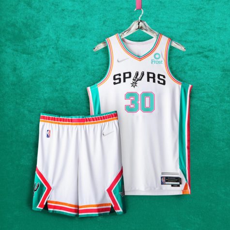
After finding success with their beautiful “Fiesta” color scheme of teal, burnt orange and hot pink on last year’s City Edition units, this year the Spurs fully embraced the party.
The reason why these uniforms tick all the boxes is they incorporate numerous
aspects of the Spurs’ storied history, including the Dallas Chaparrals and American Basketball Association logo from the beginning of the franchise, without being too abrasive. Furthermore, the white backing of the jersey highlights the vibrancies of the color scheme and ties each unique aspect of the jersey together.
My only critique of the jersey is that the retro San Antonio font could have worked better with the general “retro” vibe, but the current Spurs’ logo still grounds the uniform and polishes the look.
The Worst:
Boston Celtics: 1.5/5
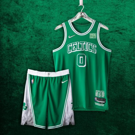
The Celtics have been consistently hit-or-miss with any uniforms that stray away from their classic home white or away green jerseys, and these are no different.
Green and white will always be a clean color scheme, but I would have preferred further experimentation with the black and gold palette that has worked in the past.
Overall, the entire jersey looks thrown together. The “retro” lettering does not stray away from their normal lettering enough to pop out at all, the numbering font is boring, and overall the green with green uni-shorts combo looks less polished. For such a storied and iconic franchise, they should be able to create a better City-Edition uniform.
Oklahoma City Thunder (OKC): 1.5/5
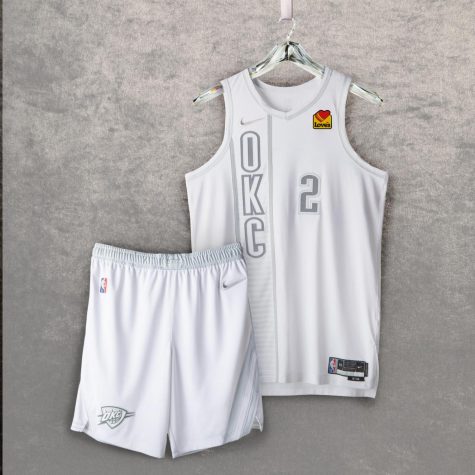
The majority of the Thunder’s history lies in Seattle, which designers were smart to avoid referencing due to the controversies and general distaste throughout the NBA surrounding their move to Oklahoma.
However, a lack of history does not cover the fact that designers had a lot to work with in terms of OKC’s jersey history that contains ideas and color schemes that do not appear.
The actual design of the uniform is solid, as the vertical torso letter marks and number outlining work well together, but the entirety of it being white hides any interesting aspects of the design.
New Orleans Pelicans: 0.5/5
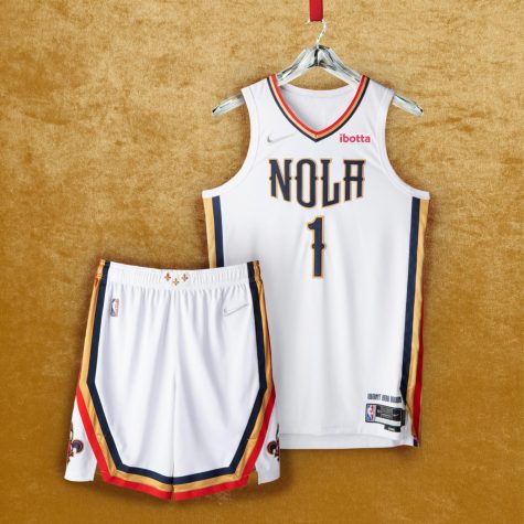
According to Nike, the Pelicans City Edition uniform is “purposely simplistic” because it is the league’s youngest franchise, named the Pelicans in 2013.
To be tasked to represent one of the most vibrant cities in America in one design is daunting, especially when the franchise you are trying to represent has a jersey history that is rather lackluster compared to others.
However, Nike’s final product is nearly indistinguishable from the Pelican’s normal home jerseys. Any deviation from New Orleans’s usual color palette or logos would have been interesting, but all Nike was able to produce is their home uniform with a slightly different logo. What a disappointment.