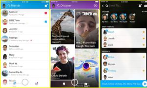
Picture the lot at 7:30 am; there is an easy flow of traffic, some arriving and others leaving. It is a simple system, not overwhelming and fairly straight forward. This is fairly similar to the way Snapchat functioned in its old format.
However, the most recent update left more than half a million people angered with its “enhancements.” Now, the app lacks the user-friendly, simplistic interface it once had. In a way, the update resembles the navigational difficulties and stressful environment of the Redwood parking lot.
Snapchat is one of the most commonly used social media apps, with around 50 percent of all app users having downloaded it, according to Businessinsider.com. With such a devoted audience, there is no doubt that any update or tweak to the app will leave some users disappointed.

Snapchat, although attempting to make the app more comprehensive, received severe backlash after forcing an update on unsuspecting smartphone users. Originally, Snapchat had three main pages: one to communicate with groups or friends individually, the main camera page and one to view the stories of those you follow. This third page included included a discovery section with a collection of digital magazines and social networks. With this new update, Snapchat combines the friends and story pages, leaving the discovery section by itself. This was meant to easily distinguish the friends and discovery page, making the interface supposedly less confusing for people who aren’t familiar with the app, according to snapchat.com. Snapchat also stated on their website that around 70 percent of all their users are between the ages of 13 and 34. In an attempt to broaden its fairly limited age spectrum, the app was updated, supposedly to create a less confusing and more cohesive experience. Although the update’s intention was to simplify the interface, by separating the friends and discovery sections it clutters the screen and creates an overwhelming experience for users. Now, imagine the parking lot around lunchtime: confusing, overcrowded and sometimes the last place you want to be. Snapchat mimics this miserable experience perfectly.
Along with the change to its platform, users have noticed a significant increase in the amount of advertisements present in the app. Although nowadays you’ll find most social media platform filled with advertisements for other apps and games, Snapchat overcompensates. Being constantly bombarded with random ads of no relevance takes away time from the entire Snapchat experience. This was not only a problem with past updates, but seems to have been amplified with the most recent one. Similar to rainy days, when flooding causes the likelihood of a car crash to skyrocket.

Not only are people fuming over this new update, but some have fueled their anger into action, petitioning to ultimately revert Snapchat back to its original form. With over 585,000 signed petitions at Change.org, upset users are showing their displeasure with the new format. With countless social media memes and videos on Youtube on how to “hack Snapchat” back to its old design, people have been criticizing the new format. If Snapchat don’t decide to take action soon, it is likely they will lose users and subscriptions.
All in all, the new update needs change, whether its creating a new, less cluttered design or even reverting back to the old format. This would make the app easier to navigate, help extend age range, and even build support from existing users. As for the Redwood parking situation, all hope is lost.


