Data Study: Education Enrollment Trends and Bay Area Test Scores
By: Adam Kreitzman
Education is largely considered to be an essential part of our society, and level of education is a major determinant of long-term success, a well-informed society, and a thriving economy. This raises the question: What is the best way to educate our youth so that they are primed for success in their future? By looking at government data, we can see some general trends that will help to hint at both where students are having success as well as what types of schools are having success.
Important Note About the Graphs Used in this Story:
Due to the thousands of data points from government records included within this story, a variety of different graphs were used to try portray this data effectively and efficiently. Since some may be unfamiliar with the functions of these graphs, I’ll include summary of what each graph is meant to show for easier understanding.
The first graph that is included in this story is a scatterplot. The function of this graph is to show year-to-year change over a long period of time. In this case, it is showing how the change in student enrollment for different levels and types of schools.
The second graph included is a boxplot. Every dot that is included in this graph is an individual school in the county, and the function of the boxplot is to break up all of the data points into four different quartiles. The middle line is the median of the data set, the two others lines at the end of the box are the first and third quartiles. The length of the line that extends on both ends of the boxplots is calculated using this formula: 1.5 * (3rd quartile – 1st quartile). Any points that fall outside of this line are considered to be outliers in the data set.
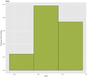
The third and final type of graph used in this story is a histogram. This is meant to show the number of schools who scored in a particular range of values. The number of “bins” or ranges included within the histogram is calculated by taking the square root of the total number of data points and rounding up to the nearest integer. The total range is then divided by the number of bins to calculate the length of each individual range.
Part 1: Public Education Enrollment
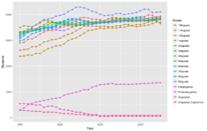
Over the past two decades, the number of students enrolled in public schools has plateaued, hovering at a little more than 90 million students nationwide. This is quite unsurprising, considering this country is past the industrial phase and growing at a rate of less than 1 percent per year, according to a government census. In other words, the population of public school students is essentially keeping pace with the population of the United States. With the number of public schools nearing 90,000, the average number of students in each public school is about 1000. Looking at the sublevels of public schools, in this case elementary and secondary school (high school) enrollment, there are a couple of interesting trends. There is much more variability in secondary school enrollment, but far less variability (year-to-year change) in elementary school enrollment. The reason for this could be a number of factors, but it is most likely because high schoolers are able to drop out and might be inclined to attend a private school. Additionally, homeschool enrollment has dropped significantly in the past two decades, possibly because of increased faith in the public school system and a greater acceptance of Common Core standards.
Part 2: Charter School Enrollment
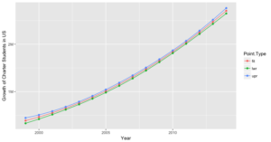
Charter schools are mostly publicly funded and sometimes receive additional private funding. The aim of these schools is to offer a smaller class size and either a more rigorous or specialized curriculum compared to that of a public schools. Oftentimes, they are established in lower-income neighborhoods to attempt to provide a better education. The mission statement of prominent charter organization KIPP (Knowledge is Power Program) reads: “To create a respected, influential, and national network of public schools that are successful in helping students from educationally underserved communities develop the knowledge, skills, character, and habits needed to succeed in college and the competitive world beyond.” The charter system has grown almost exponentially over the course of the past two decades, mainly due to its extremely positive portrayal in the media. While some charter schools do offer a very good education, the charter system is not perfect. The earliest data on charter school enrollment dates back to 1999, and in the 15 years after that, charter school enrollment increased almost ninefold. The latest reported data, in 2014, shows that there are around 2.7 million kids who are currently enrolled in public charter schools, compared to just under 350,000 kids in 1999. With 6,633 charter schools in the country, the average number of students per charter school is approximately 405.
One issue that arises with charter schools is their volatile nature. For every two charter schools that are created, approximately one gets cut or disappears. So while some find plenty of success relative to their respective location, many fail quite quickly or are never approved to begin with.
Part 3: Difference Between the Two Systems
While both are publicly funded systems of education, the two aforementioned systems could not be more different. Charter systems offer a smaller education setting that is often meant to tailor to a specific interest, to a specific student body, or to include increased rigor. It is also important to note that there are two different types of charter schools. Some rely solely on public funds, while others are privately funded by a person or corporation. This study only includes data from public charter schools, as private charter schools are not required to release this information, nor are private schools in general.
Part 4: Comparing Standardized Test Scores Between Counties in the Bay Area
Disclaimers:
- All of the data used in this study comes courtesy of the LATimes, who received it from government records in 2012. This was from five years ago, but no more recent records were readily available to the public. Nonetheless, school results do not vary much from year to year, so this data will still give us a good measuring stick.
- This portion of the article uses the mean SAT score of each school as a means of quantifying success, as the score on the test is supposed to reflect college readiness. However, this is by no means an exact reflection of school success and is not the only indicator, it is just being used as a potential measuring stick of how each school’s students are able to perform on a nationwide test that isn’t specific to any school.
- Within the category of charter schools is those who receive private funding. However, the data on the test scores of these schools is not easily accessible, and so only strictly public charter schools were included within this study.
- This is an observational study, which means it is impossible to prove a cause-and-effect between any of the findings within this study. Any notable data should be regarded as a correlation, not as a cause-and-effect. Essentially, it is impossible to prove a county or type of school scores better on a test because of the schools’ superior curriculum and teaching, but it is possible correlate living in a particular region or going to a specific type of school with scoring higher on a test.
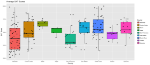
Mean SAT Score in Bay Area: 1497
Marin (7 Schools): Marin had the highest median SAT score among all counties in the Bay Area with a median of 1674, and also had a mean of 1664, although the small sample size (7 schools) certainly makes this a weak data point. The boxplot has a very small range, as Redwood is at the top with a score of 1762 and Novato is at the bottom with 1558, which is not a big discrepancy (A range of 204). With Marin being among the most wealthy counties in the Bay Area, it is not entirely surprising that they would have higher test scores, but what we don’t know is whether this is the result of superior public schooling or the parents’ ability to afford private tutoring lessons.
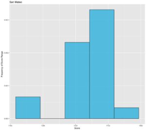
San Mateo (20 Schools): San Mateo had the second highest median SAT score in the Bay Area with 1596 as well as a mean of 1568. San Mateo had a much bigger range of 604, with the highest average SAT score of 1767 belonged to Menlo-Atherton, while the lowest average SAT score of 1163 belonged to Stanford New. San Mateo’s data was skewed to the left, as small group of schools had very low test scores, contributing to its mean being quite lower than its median.
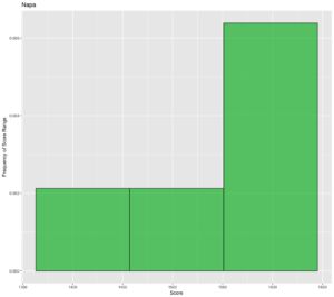
Napa (5 Schools): Napa’s very small sample size makes it difficult to draw many conclusions, though its median score of 1569 places it at third in the Bay Area. The data is skewed to the left, however, as its mean score is only 1522. Napa High had the highest mean score of 1582, and Calistoga Junior-Senior High had the lowest with a score of 1394. Its range is very low at 188, which can be attributed to the small sample size. Essentially, the schools in Napa tend to performed average to above average all around, but none of the schools have exceptionally high or exceptionally low test results.
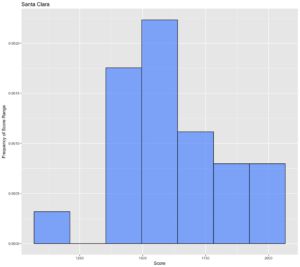
Santa Clara (44 Schools): Santa Clara had the fourth highest Bay Area median SAT score at 1553, although its mean score was a 1600. This is due to the fact that there is a high concentration of schools with extremely high test scores. The highest SAT average was Lynbrook at 1999, while the lowest was Latino College Prep at 1144, which means the range was 855 (extremely high). Santa Clara is a pretty diverse demographic so the large variance in test scores is understandable. Cupertino and Palo Alto (Silicon Valley) tended to do very well whereas the poorer parts of San Jose did not perform as well. With 10 schools at 1800 or higher, there is a case to be made that Santa Clara’s top schools are the best in the Bay Area. Santa Clara’s data was skewed to the right, as a collection of schools had some very high test scores, which was responsible for its mean being so much higher than the median score, and this was most likely the result of the very diverse population in Santa Clara County.
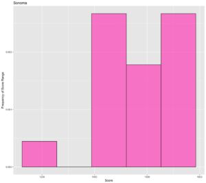
Sonoma (17 Schools): Sonoma’s SAT scores were very average for the Bay Area, as its median SAT score of 1546 puts it at fifth in the Bay Area (In a sense, Sonoma had the median median SAT score). Sonoma’s SAT data is skewed to the right, which is why its mean is much smaller than the median at 1568. The worst schools in Sonoma performed very poorly on the SAT, whereas the rest tended to perform above average. The highest average SAT score in Sonoma belonged to Maria Carrillo with a score of 1774, and the worst belonged to Roseland Charter with a score of 1245. The range of 529 is very high for a county with a smaller sample size. The fact that both the highest-scoring school and the lowest-scoring school came from Santa Rosa shows the diverse demographic within Sonoma.
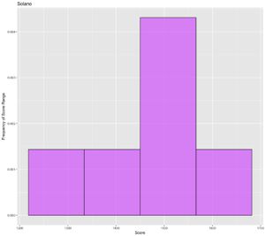
Solano (12 Schools):
The median SAT score in Solano was 1477, though the lower-performing tended to score particularly low as the mean was just 1458, decently below the average score in the Bay Area. The data was skewed left, meaning the lower half of schools performed worse comparatively than the upper half of schools performed well. Considering that Solano is the poorest county in the Bay Area in terms of per capita income, the fact that they are this far up the list is actually quite impressive. Of course, the schools in Benicia, Vacaville, and Fairfield did better than the schools in Vallejo (The poorest part of Solano), but as a whole they did not do bad at all considering the circumstances.
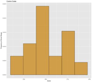
Contra Costa (31 Schools):
Contra Costa spans a large portion of the northern East Bay, with 31 schools in the district, so it is relatively unsurprising that there is a massive range of SAT scores in the county. Miramonte scored the highest with an average of 1870, whereas Kennedy scored the lowest at 1138. This is a range of 732, which is very high, especially compared to the other data sets within this sample. The southern part of Contra Costa (Orinda, Moraga, Lafayette, San Ramon) typically performed the best among schools in this county, whereas schools in Richmond struggled to perform up to par. The East Bay in particular is very diverse, so it makes sense that there would be a wide range of scores. Because the data is skewed to the right, it make sense that there is such a discrepancy between the median and the mean (The median was 1476 whereas the mean was 1518).
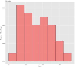
Alameda (64 Schools):
With 64 schools, Alameda was easily the county with the largest collection of schools, and also had a massive range of SAT scores. While its median SAT score was the second lowest among schools in the Bay Area, there were quite a few schools that performed exceedingly well. Mission San Jose had the highest score in Alameda, and one of the highest scores in the Bay Area at 1981. On the other side of the spectrum, the lowest scoring school in Alameda, East Oakland Leadership Academy, had the worst score in all the Bay Area at 1014. This range of 967 is extremely huge, and the skew is a little to the right, as the mean of 1395 is greater than the median of 1378. The data is pretty spread out, however, as there aren’t many clusters of data within the range, which is why the histogram is rather normal shaped.
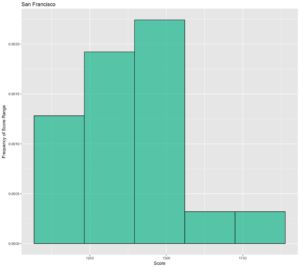
San Francisco (19 Schools):
The county with the lowest median average SAT score of 1307 was San Francisco by a pretty big margin, though this was mainly caused by a high concentration of schools scoring in the 1200s. On the whole, San Francisco had schools that performed quite well, which is why the data is heavily skewed to the right and the mean is much higher than the median at 1382. Lowell had the highest average SAT score in the San Francisco county at 1836, whereas City Arts and Tech had the lowest average SAT score of 1179. For a smaller sample size of only 19 schools, a range of 657 is abnormally high, which highlights the large amount diversity in San Francisco. Noting that Lowell’s score was much higher than any of the surrounding schools, it is important to point out that Lowell is considered a “magnet” school, which means it is meant to attract more driven students because of special accelerated learning programs that it offers.
Part 5: Comparing Charter School Test Scores to Public School Test Scores
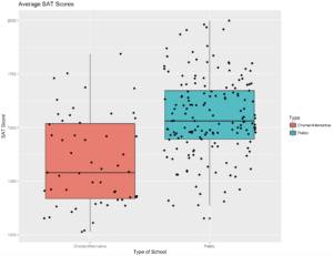
In the year 2012, there were three times as many public schools as charter/alternative schools (165 vs. 55). In comparing the two different datasets, it is quite obvious that public schools performed much better than charter schools, as public schools had a median score of 1531 and mean score of 1550, whereas charter/alternative schools had a median score of 1290 and a mean score of 1338. However, solely relying on these scores does not take into account the full picture of what is going on, given the uncommon nature of charter/alternative schools. For one, a lot of charter/alternative schools are meant to serve kids in underprivileged neighborhoods, which is why it makes sense that they would underachieve in standardized testing. Secondly, some charter/alternative schools are meant to be tailored to the arts or an alternate route of education, which is why students from these schools wouldn’t do as well on standardized tests, as they aren’t in schools considered standard by any means.
Public Schools (165 Schools):
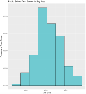
The average SAT data set of public schools is relatively symmetrical. The range of scores is 923 and the quartiles are evenly spaced from the median. The median score is actually higher than the third quartile score of charter schools which indicates a massive gap. The data on public schools is unsurprising because these schools mainly operate in the same set of rules. The gap in scores is generally caused by the difference in resources and number of driven students, rather than a fundamental flaw or difference in the education, which is why the data looks symmetrical as a whole. The schools that tended to do well on the SAT generally came from more wealthy areas where the schools were able to offer more challenging and diverse curriculum, whereas the schools that struggled tended to come from less wealthy areas where the schools weren’t well-funded enough to offer their students anything other than basic curriculum.
Charter/Alternative Schools:
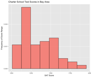
This data set was way more whacky then the public school data set. It is skewed to the right as the mean is significantly higher than the median. This is mostly because there is a high concentration of underachieving schools and a few schools that did quite well. A lot of the schools who found themselves on the lower end of performance on tests did so not because of a failure to teach well or develop good curriculum, but most likely because of extenuating circumstances. For instance, a lot of charter/alternative schools either serve underprivileged kids or have more specialized curriculum that isn’t meant to prepare a college student. As a whole, charter/alternative schools did not do as well on the SAT as their public counterparts, regardless of where they were located or what their intent was. While these schools do serve a purpose the constant media praise of charter schools does seem to be misplaced, and the idea that charter schools should serve as a more standard form of education does not seem to be valid.
Part 6: Conclusion; What does all this mean? A few takeaways!
Takeaway 1: Public schools should remain the standard form of education.
Because they have more funding, public schools are able to offer more diversity when it comes to classes, and from the looks of it do a better job on the whole of preparing their students for college. The top public schools have very high averages on the SAT score which means a large chunk of their student body is doing very well.
Takeaway 2: The charter system does not need a rapid expansion.
Not even the top charter/alternative schools kept pace with the most successful public schools. It is clear from this that driven students are able to succeed in a public school setting. Consequently, charter schools are more useful for kids who need unique guidance and instruction or would like to specialize their education.
Takeaway 3: The charter school mystique is nothing more than a… mystique.
You would be hard-pressed to find any significant data that shows charter schools to be extremely successful as a whole. They do offer a nice alternative to our public schools, but portraying them as the future of our education is borderline ludicrous. Charter school enrollment has been shooting up for the past two decades, and though this is somewhat reasonable considering it is a relatively new form of education, it most likely will not continue growing at this rate, especially considering how difficult it is to create and maintain a charter school.
