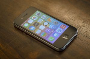
Today the public version of iOS 7 comes for iPhone 4, iPad 2, and all newer generation products, the look and function of Apple products will completely change while providing new features.
Changes in the interface include a redesigned multitasking interface, a new Notification Center function called Today, and an all new Control Center where popular system toggles can now be accessed outside the settings application.
The new design is simpler than before. All the screens have been replaced with transparent elements, including the keyboard. Most buttons have been removed and replaced with colored text that matches the app. For example, Notes uses yellow text, while Calendar has red text to match the colors of the application. Icons have been redone, giving them, a tacky and childish look that lacks textures and depth.
New features have been implemented as well. For the first time, a whole new set of ringtones and text tones have been added, replacing the legendary “Marimba” ringtone that has been the default since the iPhone debut.
Swiping from the bottom up unleashes a new panel called Control Center. Common toggles such as Bluetooth, WiFi, and brightness can now be toggled here with a tap. Towards the bottom are new options as well such as instant access to a flashlight, calculator, timer, and camera, all without requiring a passcode.
iPod controls can now be found in Control Center, no longer accessible with a double tap of the home button. Instead when the home button is double tapped, the user experiences a new multitasking interface. Now the screen fills with previews of the last state apps were left in.
A new security feature has also been added for iCloud users. Now if an iPhone is set up with an iCloud account, the device cannot be re-activated if stolen and erased without the users iCloud password.
Some features may negatively impact current iOS 6 users. For example, certain common features have been removed. Since some of the earliest versions of iOS, iOS users have accessed their iPod controls by double tapping the home button. Now they are only available by swiping up from the bottom of the screen. Swiping to the left during camera view no longer shows the camera roll, but now switches between video, photo, and panorama modes.
These changes take some time to adjust to. The less experienced users may have trouble understanding where buttons have been moved. Buttons on the screen are no longer labeled, but are just colored text, and don’t indicate what can be tapped.


